fbpx
Title Image

Trends

modern living room with pink and orange accents

Pantone’s 2023 Color of the Year: Viva Magenta

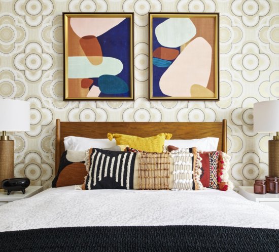
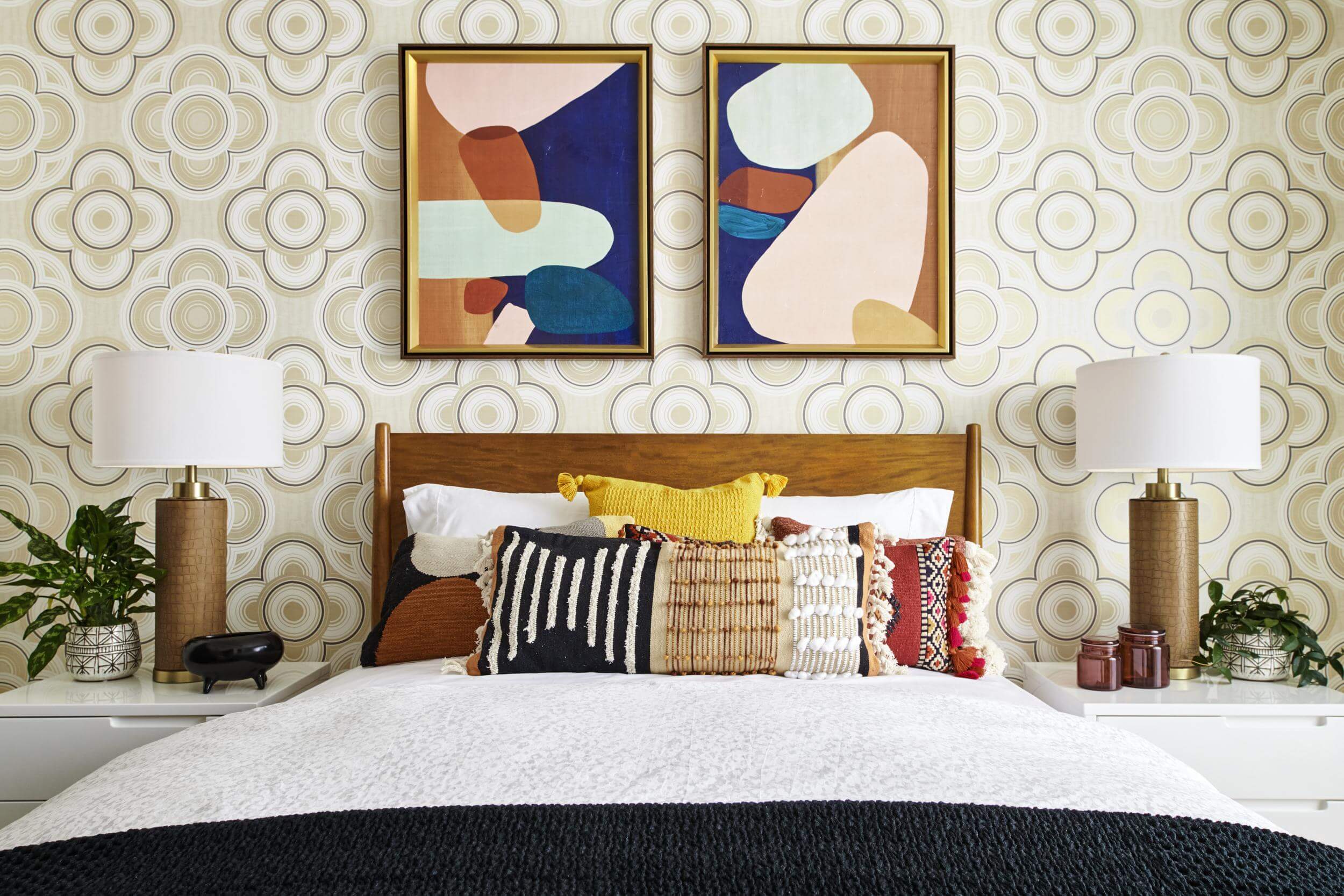
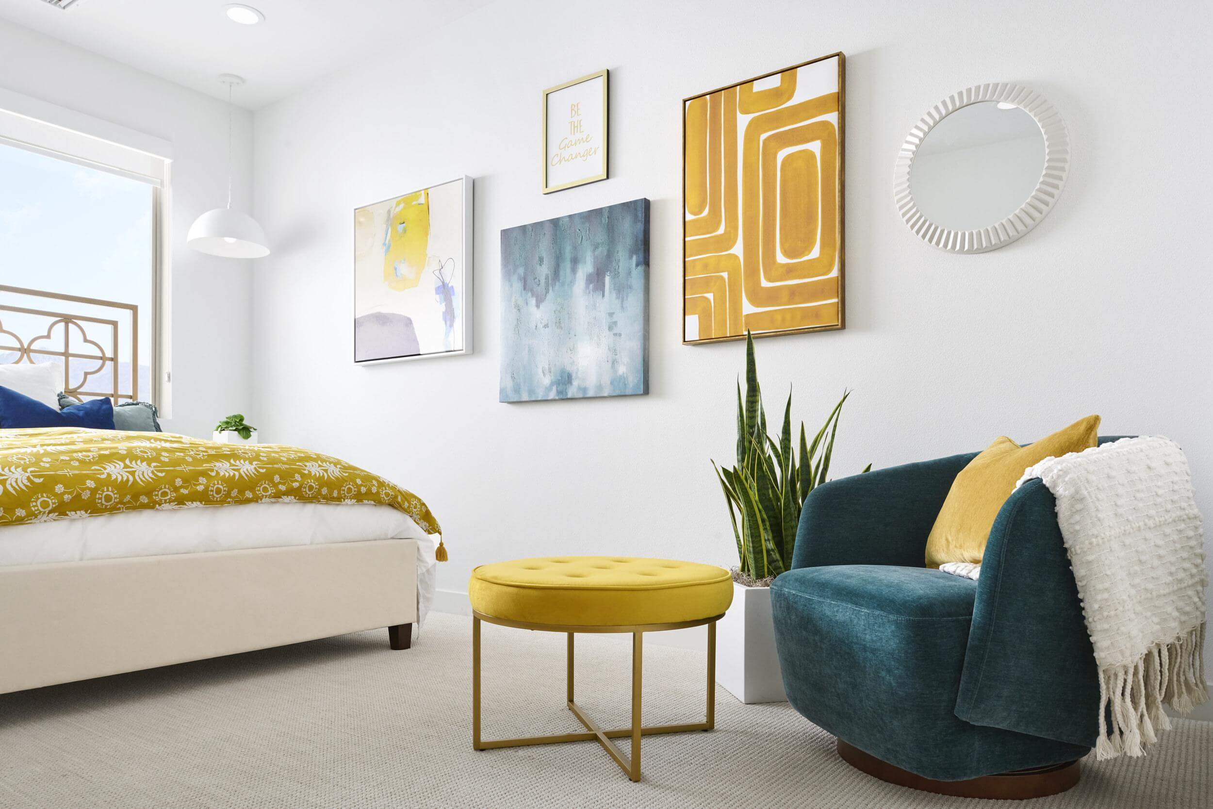
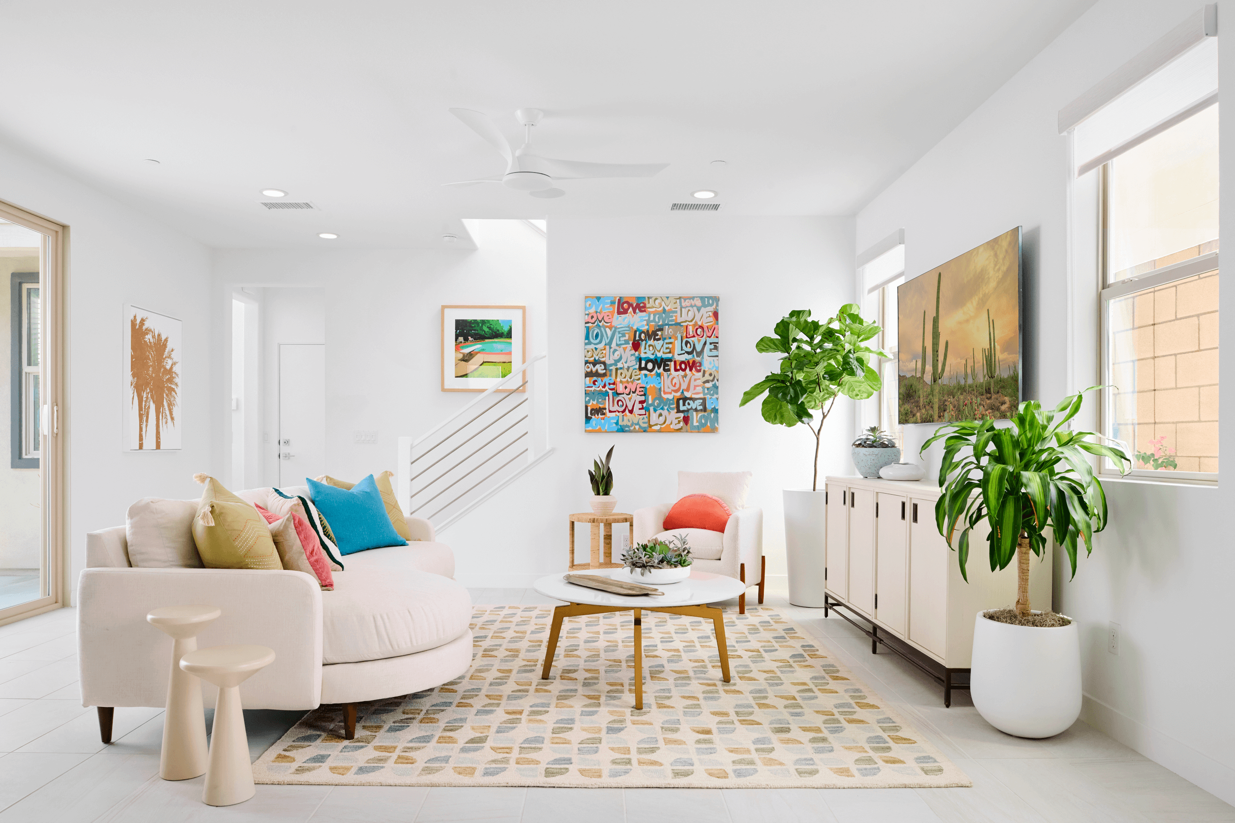
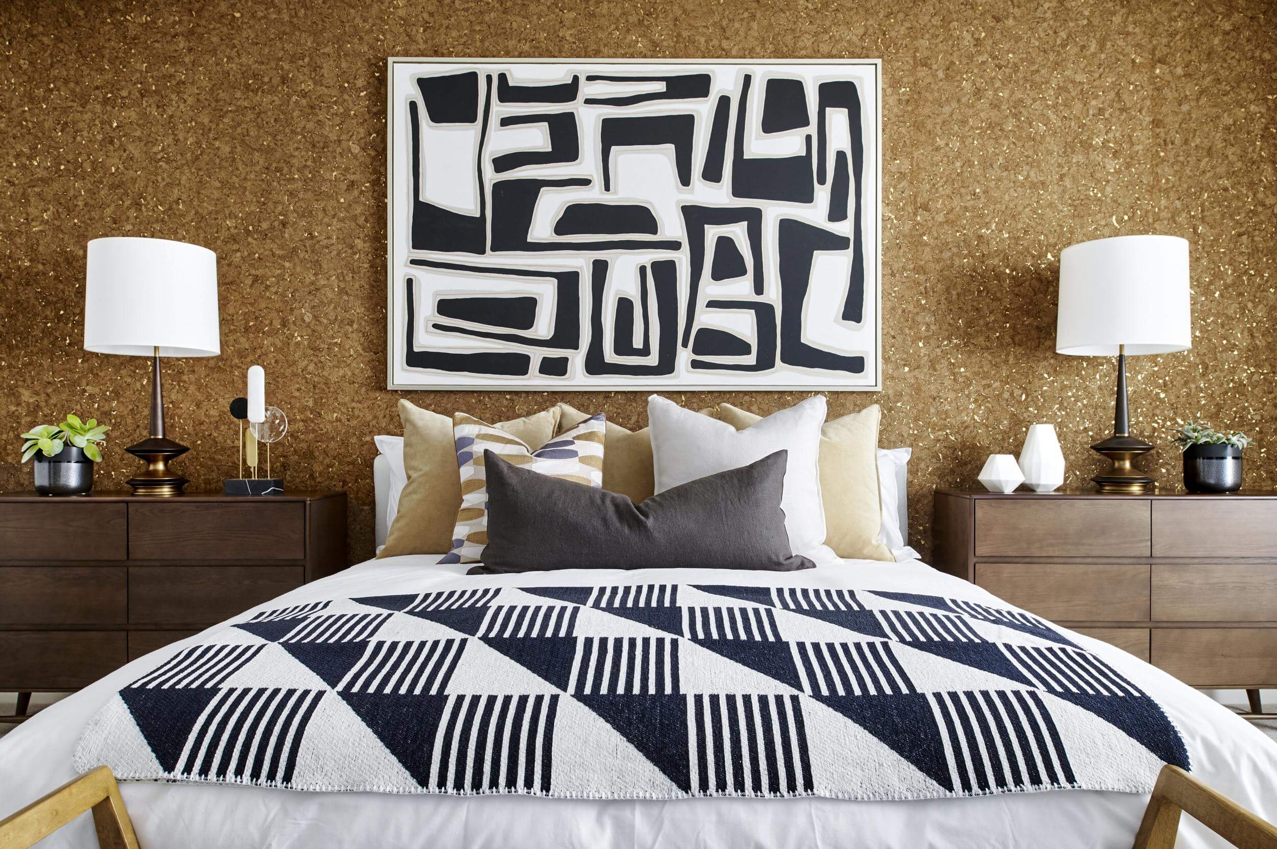
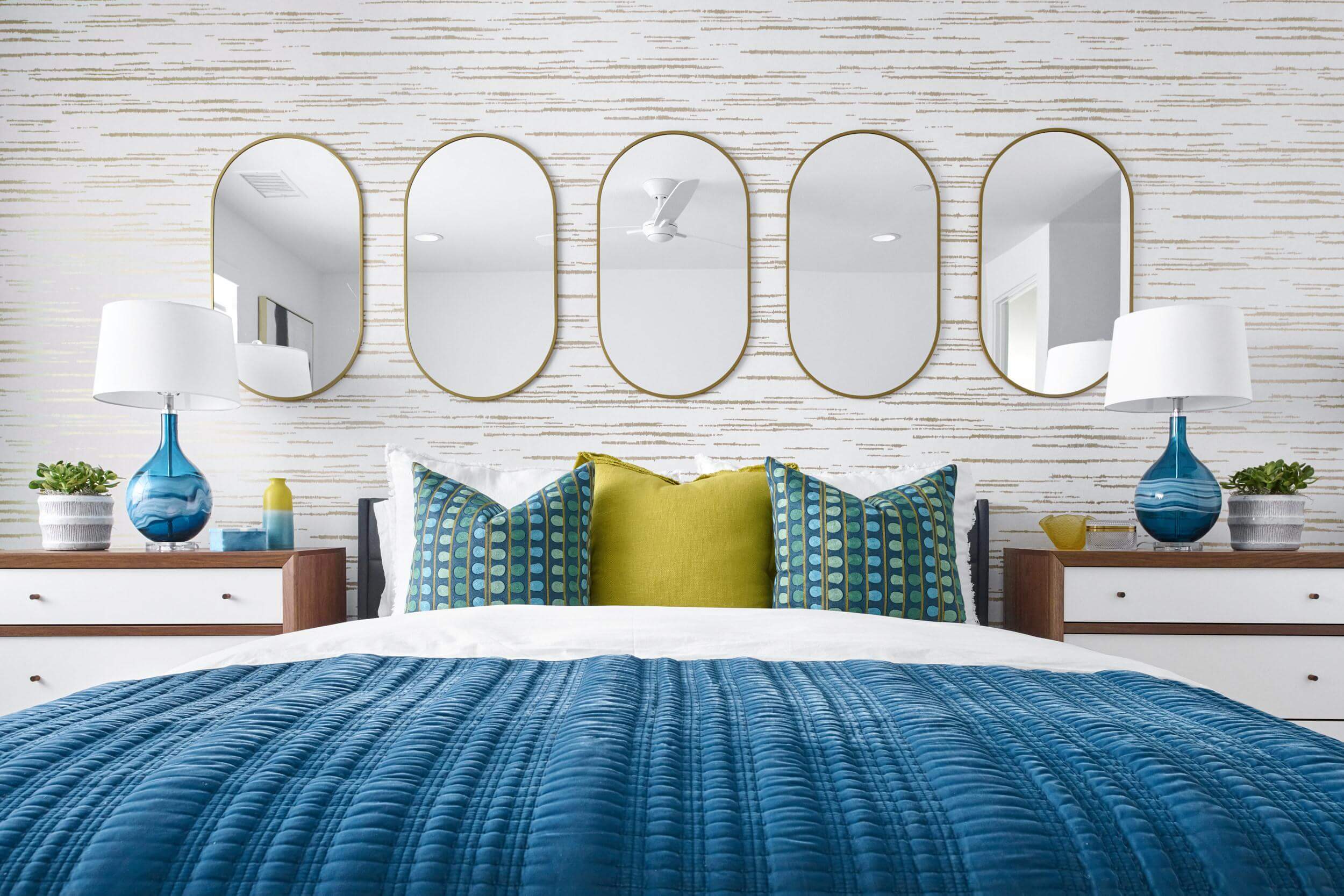
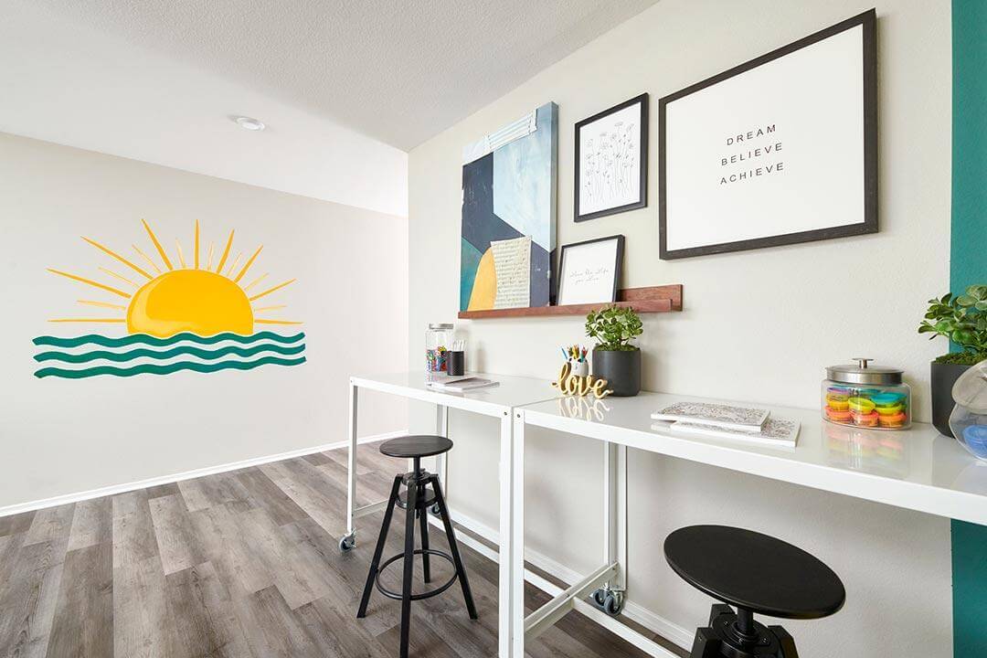
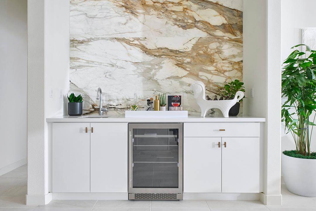
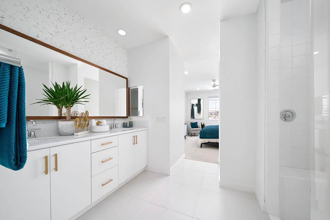
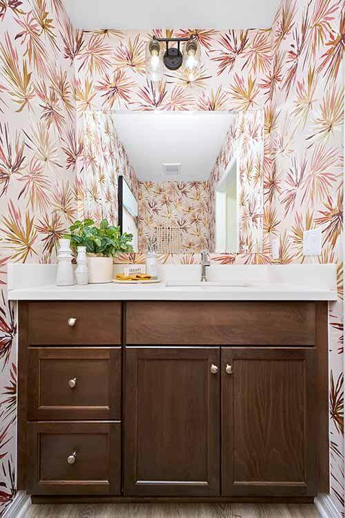
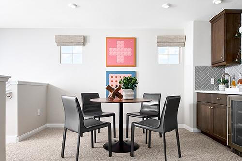
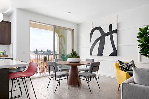
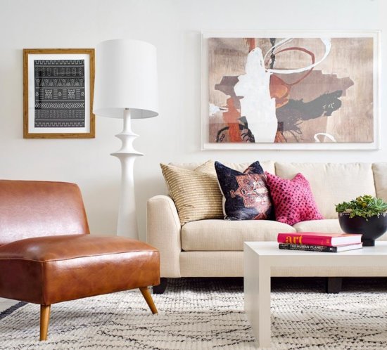
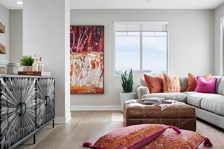
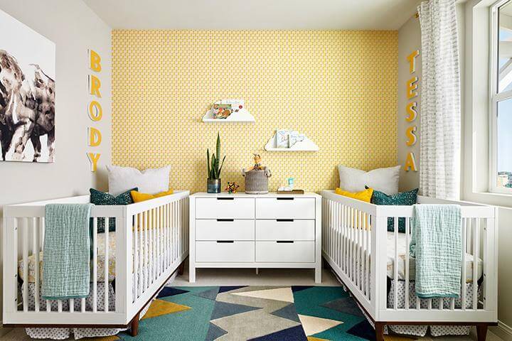
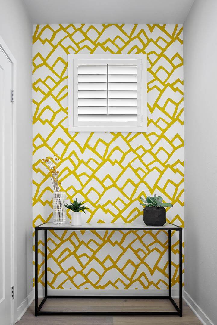
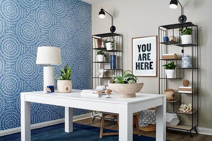
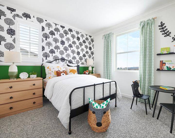
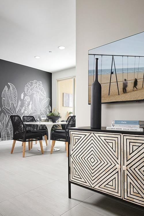
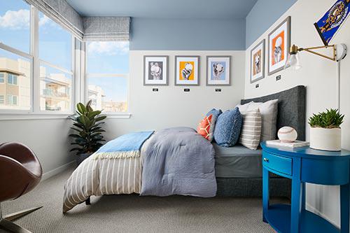
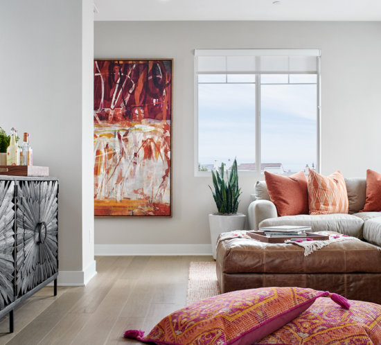
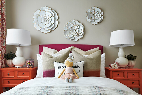
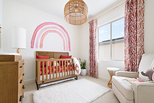
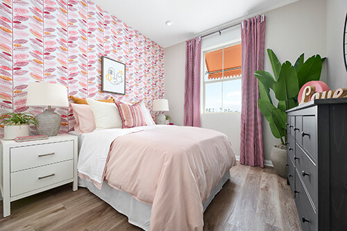
The wait is finally over; Pantone has announced their color of the year for 2023: Viva Magenta! This color is an unconventional hybrid of red and pink that’s rooted in the natural sunset hues we’re all familiar with. Signifying strength and optimism, this year’s color is a bold shift from 2022’s lighthearted pastel, Veri Peri. Viva Magenta is bold and joyous—exactly the mindset we aim to keep as we go into this bright new year. This pink and red hue is fabulous for interiors because it encourages self-expression, confidence, and joy as it captivates the attention of a room. It works best as an accent due to its visually loud nature, and when mixed with other colors, it’s ideal for large-scale applications like wallpaper. We have also used this shade for upholstery on furnishings, such as a small desk chair and a headboard. The effect this color has is beautiful, especially when used in small, tasteful touches, be it accent pillows or artwork. We can’t wait to take this fearless shade into 2023 and make a statement with its empowering energy as we take on an exciting new year!

bedroom with beige wallpaper and modern art

Groovy, Funky, and Thriving With Retro Interiors

As we move into 2023 and reflect upon all the amazing gifts 2022 has given us at Chameleon, we want to look back just a bit further. Recently, there has been a resurgence of 50s, 60s, 70s, and 80s-inspired design elements in interiors, and we’re loving it! There isn’t just one way to make a space “retro,” but we have a few tips and tricks from decades past that we love to incorporate into our home designs to achieve those epic looks.

When we want to add a bit of 50s style flair, we incorporate fresh pastels into our color schemes. These bright hues keep a space playful when combined with white tones. Bright white walls and pastel accents create a clean, modern touch without being too reminiscent of “I Love Lucy.” Adding a sleek Eames chair to a corner easily completes this 50s-style decor trend.

For a bit of a 60s groove, we like to use organic-shaped furnishings—whether that’s in the form of an accent chair, sofa, or even a glossy white dining table and chairs. Of course, we can’t mention this time period without incorporating midcentury modern design, which is trending once again. Warm colors like oranges, reds, and browns add depth and stylistic intrigue that align with this mellow era.

We get funky with a nod to 70s style by using lots of walnut-toned woods through furnishings and accent decor. Pattern is also a big inspiration from this era, and we channel the decade’s carefree spirit with retro, tiled backsplashes, patterned rugs, and abstract artwork.

While most people gravitate toward the 60s and 70s-inspired decor when going for a retro interior, certain 80s trends also greatly enhance this goal. Transparent furnishings, like acrylic chairs or coffee tables, offer an unexpected and unobtrusive addition to colorful spaces.

living room with blue and emerald green accents

Elevate with Emerald Green

Modern environmentalism is taking the stage for interior design trends, and we’re seeing a bold shift to natural textures and forest-y tones. As we lean into soaking rooms in natural light and decorating with seasonal houseplants, we’re reminded that nature’s beauty is our true source of inspiration. Sage and moss greens are a soft, lovely addition to any space, but emerald green—their opulent, sophisticated sister—is attracting the spotlight this season. Emerald adds the perfect amount of depth and moodiness that complements the cold weather and the return of deep, fall-inspired hues. We love this shade in all its jewel-tone glory, whether it’s delivered in a bold splash of paint, a few simple accessories, or revamped upholstery. Naturally, like all the best things in life, emerald green is best appreciated in moderation. Rather than dousing all the walls of a room in this shade, we prefer to use touches of it where it can truly shine and have the grandest effect. For example, a boldly painted emerald green accent wall is an alluring pop of drama, while a velvety green accent chair can transform an ordinary room into one that’s rich, moody, and luxe. Surrounded by pale neutrals and a touch of gold hardware, this soothing, autumn-inspired color is the perfect upgrade to any room’s interior.

earth tones and desert hues in living area

WPG and Chameleon: A Beautiful Partnership

Chameleon Design and Woodbridge Pacific Group have had a fantastic working relationship and mutual appreciation spanning over 26 years. Our first project together in 1996 was Fairway Estates in Dove Canyon, and we’ve worked together ever since! Bradley Davis, the Marketing Director at WPG, states, “The Chameleon team is second to none, and I could not imagine working with anyone else for our design needs. Their eye for design speaks for itself, and the level of service they provide is outstanding. They push us to take risks, are flexible when we throw them curveballs, and are never satisfied with good enough. They are one of the most important pieces of the Woodbridge Pacific team, and it’s a privilege to work with them.”

The process of working with Woodbridge has always been an inspiring one, and our respective teams work closely on all aspects of the design process—from design inspiration to installation—and we share a mutual love for the homes we design, bring to fruition, and sell out! Over the years, our teams have had the honor of being chosen as finalists and receiving many top awards for the interior design of these model homes, sales offices, and communities. Having participated in award shows like the SoCal MAME Awards, The Nationals, and the Gold Nugget Awards, it’s clear that the collaboration between WPG and Chameleon Design is a beautiful one.

At this year’s 2022 MAME Awards, six of our model home designs for Woodbridge Pacific Homes—at University Park and Signature PGA WEST®—are finalists for the gold award. With interior design, trends are ever-changing, and it’s a top priority to make sure the home designs appeal to the target buyer. There are a few current trends we love talking about that, we think, helped us snag the judges’ eye! You can head over to the Woodbridge Pacific Group blog to see our top trends, but here are three to give you a sneak peek:

Earth Tones and Desert Hues

As demonstrated in Plan 7 at Citrine at Signature PGA WEST®.

White Interiors

As demonstrated in Plans 1 and 2 at Jewel at Signature PGA WEST®.

Slab Door Cabinets

As demonstrated in Plan 7 at Citrine at Signature PGA WEST®; Plan 2 at Nova at University Park; and Plan 1 at Jewel at Signature PGA WEST®.

white living room with blue suede furniture and checkered rug

A Dash Of Drama ft. Dark Wood

Pristine, white interiors had their moment in the sun, but now we’re seeing dark and moody spaces taking the spotlight. While soft, Scandinavian shades and blond woods have been a favorite in recent years, we’re embracing high contrast interiors with dark wood tones that envelop and welcome you. Deep brown colors evoke sophistication and bravado, and when paired with soothing houseplants, can have a calming effect. This style beautifully complements contemporary aesthetics and furnishings, which playfully aligns with the resurgence of modern home decor. We are careful to ensure the space doesn’t become overly dim by incorporating light, contrasting elements. In a kitchen, dark wood cabinetry looks great in conjunction with a pale-colored island and countertop. However, this effect isn’t limited to cabinetry or any other finish in the home. In our projects, we’ve used porcelain tile with the appearance of natural wood across an entire wall as an accent wall, and the effect it has is showstopping and unique! We’ve also used wood veneer wallpaper to create a feature wall for a similar effect. Dark, dramatic wood undertones stylishly elevate any interior, and provide a handsomely grand vibe.

bright living room with a brown leather club chair, abstract art, and colorful throw pillows

Leather: A Classic Textile

Leather is a classic, timeless textile that continues to build in popularity in 2022, and for good reason. Homebuyers are focusing on natural materials that provide comfort in their ideal homes, and leather accomplishes this goal in a variety of ways. Our designers will often add just one leather element in a space, and its unique, textural contrast makes it truly stand out among the other pieces in the room. Incorporating leather seating at a dining table, or via a barstool, club chair, or ottoman, adds a flair of desirable sophistication and drama that draws in the eye and creates a showstopping effect. This textile, with its variety of textures and colors, can easily be incorporated into a modern, contemporary, or vintage aesthetic. From the typical warm brown tones, to stark black, or even brightly colored hues, there’s a shade of leather to fit every home.

tonal gray hexagonal wallpaper, wood desk, matte black bookcase, cream and black area rug in home office Allevare

Bold and Beautiful: Wallpaper Accent Wall

When someone says “accent wall,” does your mind instantly gravitate towards paint? If so, you’re not alone, because most people would say the same. And understandably so – paint is a great low-commitment way to transform a room. However, there’s another great way to create a high-impact accent wall. We’re all about choices here at team Chameleon, and we’re looking at you, wallpaper. We’ve been singing wallpaper’s praises for years, so you know we love incorporating it in our clients’ model homes (they love it, too!). The right wallpaper has the design superpower of creating a bold focal point and setting the tone for the rest of the room’s design. It acts as a foundational base for other layers like color, texture, wall decor, and even greenery.

Wallpaper as an accent is about captivation and drawing the eye into a room in an unexpected way. It can add an upscale feel to model homes and unify a room’s theme. A wallpaper accent works especially well in kids’ spaces, acting as a narrative design element that tells a story, like the adorable woodland and insect-themed rooms our team created below. When incorporating an accent wall into a space, we’re always intentional and strategic about which wall gets the full wallpaper treatment, and which elements work best alongside it. It’s a delicate balancing act, and our clients and their home buyers love the results.

glass dining table and rattan chairs with large-format pastel abstract artwork Chateau Estates

Easy Spring Style — Pretty Pastels

Spring is here, and it brings with it a desire for fresh and clean interiors. We’re saying hello to pretty pastels, a collection of subtle colors that can create a calming, sophisticated, or whimsical look depending on the application. And while pastels for spring aren’t exactly groundbreaking, hear us out. Once reserved for nurseries or kids’ rooms, these cheerful hues have made their way into every room in the home. And their appeal, uplifting feel, and versatility make them a great choice any time of year. A softer palette is a lovely way to invigorate a model home — we like pairing pastels with florals for something playful, or with wood and metallic accents for a modern touch. Millennial pink in particular has had a moment, with soft green, powder blue, and pale peach cropping up in living rooms, bedrooms, and even home offices. Pastels also play well with each other, allowing us to create unique and custom looks for our clients, though we prefer sticking to a maximum of three for a clean look (and to prevent a room from resembling an Easter basket). From cool and crisp or warm and cozy, there’s a pastel shade to suit almost any preference, the pale blue sky’s the limit.

primary bedroom with black wall paneling Rancho Palma Rioja

Bask in Black

People are saying black is back, but in our view, it never went away! The chic sophistication of black accents never goes out of style. Some shy away from adding black to the home because they mistakenly think it makes a room appear dark and less spacious. In fact, a bit of black can add dimension to a room and create focal points that camouflage a small space. Pretty cool if we say so ourselves.

We love black’s visual impact and are thrilled to see its resurgence in the home. It’s always great to use black to accentuate a room’s features, but if you’re obsessed with this shade as much as we are, you may want to use it as a main focal point in a room’s design. Be brave and use black from floor to ceiling on an accent wall or opt for an eye-catching contrast with black-and-white striped paint. Go architectural with black interior window panels to frame and separate spaces while maintaining sightlines. In a room layered with whites and neutrals, a pop of black is an edgy counterpoint that helps ground and balance the space’s ethereal quality. Like a metallic accent, a little black goes a long way — even a small pop of black hardware or trim will bring out the colors that surround it. It’s a fail-safe way to add depth and intrigue, no matter your palette or style preference!

living room with blue accents Modo at Novel Park

Calm Seas Ahead — Aleutian Allure

Like Pantone’s Very Peri, the color of the year chosen by HGTV Home by Sherwin Williams is a departure from all the lovely shades of light green selected by most color experts and paint manufacturers for 2022. And we love it! Aleutian blue, reminiscent of the sparkling sea surrounding the archipelago that bears its name, is equally calming while symbolizing a spirit of refreshed optimism. Blue signifies trust and creativity in color psychology, and this balance of dependability and imagination is what’s transformed it into a neutral in home interiors. Aleutian’s washed indigo hue with red undertones calls up feelings of serenity. A bit of added grey keeps the shade muted and soothing, making it a wonderful choice for creating a tranquil oasis at home. We especially appreciate its versatility, and we’ve used similar shades in many of our clients’ projects. Bathe a wall or ceiling in Aleutian to jump into this color head first, or play up a space with cool-toned accents like rugs, bedding or artwork. Like a true neutral, Aleutian works well with almost any color, though when paired with whites and warm wood textures it’s worthy of a chef’s kiss.